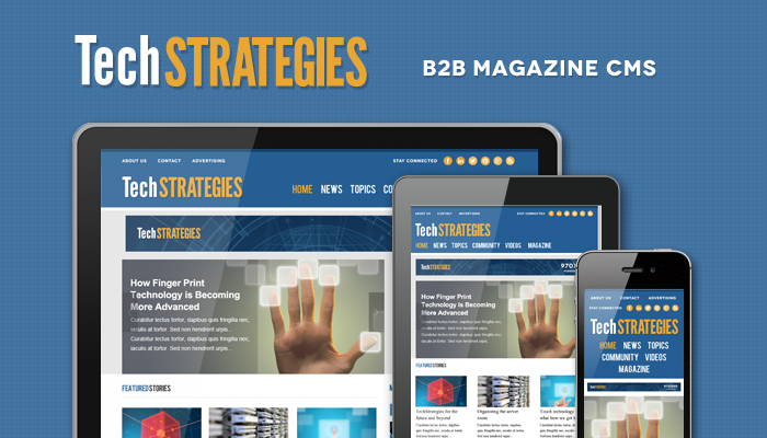
Responsive Magazine Web Design Provides Mobile-friendly SEO Benefit
Google now favors mobile friendly websites in search results. Most magazine publishers have considered the value of a responsive website and have already optimized their site so that it’s easy to view and read on both desktop, tablet, and mobile phones. It’s a great time to put yourself in the shoes of your audience and to look at the emails, social media, and other digital communication that bring users to the magazine website and how the website looks on a tablet and smartphone once they arrive. Would you stay on your website when using a non desktop viewport of the site?
Starting April 21, we will be expanding our use of mobile-friendliness as a ranking signal. This change will affect mobile searches in all languages worldwide and will have a significant impact in our search results. Consequently, users will find it easier to get relevant, high quality search results that are optimized for their devices. – All Webmasters Feb 2015 Notice
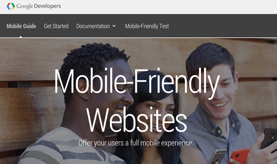
Mobile Guide https://developers.google.com/webmasters/mobile-sites/
Ultimately we want it to be easy to get and interact with information we find on the Internet. UX (user experience) has become an important foundation for all principles of design and marketing. As users adopt more tools that they carry, wear, and see around them, we must consider that everything we publish might have dozens of different viewports depending on the users hardware or location.

Google wants to make sure that search results are valuable and usable resources for the people that choose their search engine. So the new algorithm changes will favor “mobile-friendly” publisher websites. One quick way to determine if your site is mobile friendly is to use google on a smartphone and type in your website title. Hopefully your publication website already appears in the top results for that search title or niche phrase and you’ll notice looking at your mobile device and the search results that the words Mobile-friendly just under the title and preceding the website description for your search listing result.
It’s important to optimize the website for these types of SEO impact considerations but even more important to consider the audience. As a publisher we want at a minimum a weekly visit to our magazine website. And if the site is easy to use in any location, we want to be the top of mind destination for people in our target audience niche when they want to find articles, knowledge, training, definitions, news, or video. So even without a test and penalty, it’s important that staff, publisher, and CEO spend some time on their own publication websites to determine just how easy they are to use on multiple devices.